Intro
Do you ever feel a sense of anxiety or disarray when you log into your LinkedIn feed?
Does seeing a vast ocean of white ocean of space make you feel out of place or adrift?
I certainly do! That's why I decided to put the LinkedIn news feed under a microscope using UX laws as my guide and wow...! I realized that this feed significantly violates several core UX principles, negatively impacting user experience and efficiency
Initial diagnosis: The problem
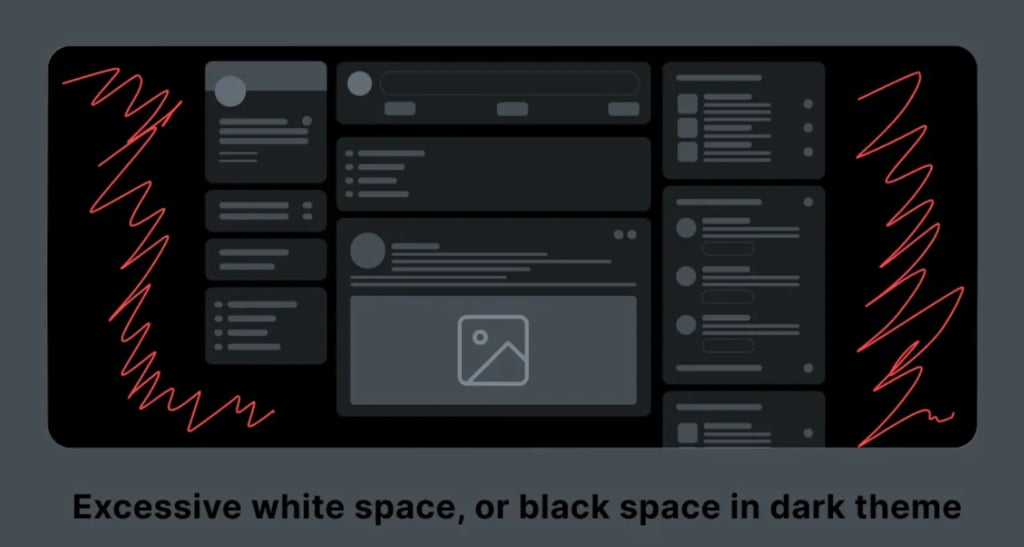
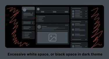
Let me start with me most obvious issue here: the inneficient use of space.
There's an excessive amount of "white space" (or black space, depending on your theme). This isn't just a waste; it also dilutes information density requires more scrolling to access relevant content quickly, directly ontribuiting to that feeling of discomfort.
If we observe the user profile section (the left column), we realize it violates the Law of proximity because relevant information - professional details, profile views, and important user elements - appears scattered without logical grouping.
This imposes a high cognitive load on users, forcing them to scan multiple areas to gather data.
Finally, the general feed information lacks coherent organization, making it difficult for users to quickly identify content types and their relevance. This lack of structure and visual hierarchy in the feed flow reduces information consumption effiiency and the user's ability to interact with the content. With this clear ideia in my mind, I developed a Case of study to propose a solution.
My callenges
I am truly aware of the challenges I’m about to face, that’s why I broke them down into one general and two specific points.
General
Would be create an interface that effectively serves the user without sacrificing simplicity and efficient information consumption.
Specifics
Integrating UX laws for an intuitive and natural interface: Applying the Law of Proximity, Fitts’s Law, and Jakob’s Law, for example, must ensure that the proposed solutions are highly functional. And
Achieving a balance between technical feasibility and user needs: Considering that any changes must be implementable on a platform as complex as LinkedIn without compromising its performance or stability, and taking into account technical limitations.
It’s crucial to remember that the LinkedIn feed is a vital user tool, so this redesign must facilitate rapid identification of relevant information, reducing friction.
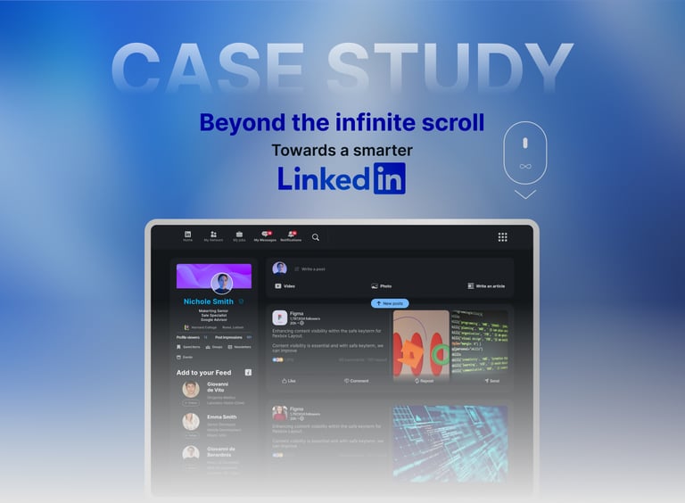
Case Study - Reimagining
the LinkedIn feed.
My central purpose here is to transform the user experience by resolving critical usability, efficiency, and cognitive load issues observed through a user-centered approach and the application of proven UI/UX principles.
I aim to propose a solution that optimizes how professionals interact with content and build their connections, with a strong enhancement of its aesthetics.
This is the structure you’ll find in this document:
My solution: Central concept
I have decided to focuse on a intelligent spatial optimization and contextual grouping of information, reducing cognitive load.
The goal here is to transform the LinkedIn feed into a more organized, visually clear, and intuitively functional space where users can efficiently consume information.The goal here is to transform the LinkedIn feed into a more organized, visually clear, and intuitively functional space where users can efficiently consume information.
To achieve this, I’ve selected and applied the following UX laws:
Law of Proximity:
This dictates that related elements should be grouped to reduce cognitive load. Therefore, all profile information, or the elements of a post, will be visually grouped to create coherent units.
Fitts’s Law:
This dictates that key interactive elements (buttons, links) should be sufficiently large and located in easily accessible areas, minimizing the time and effort required to perform an action.
Jakob’s Law (Principle of Familiarity):
Familiar design patterns will be maintained where appropriate to avoid dissonance for users accustomed to the platform, ensuring a minimal learning curve.
Finally, the general feed information lacks coherent organization, making it difficult for users to quickly identify content types and their relevance. This lack of structure and visual hierarchy in the feed flow reduces information consumption effiiency and the user's ability to interact with the content.
With this clear ideia in my mind, I developed a Case of study to propose a solution. I've redesigned the following key elements:
Application of UX Laws
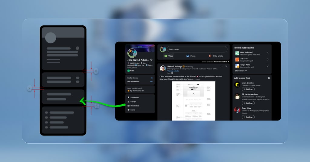
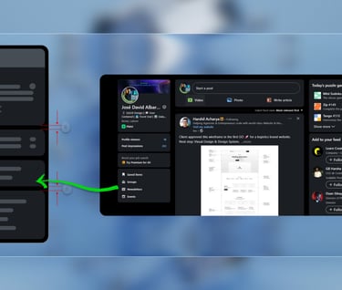
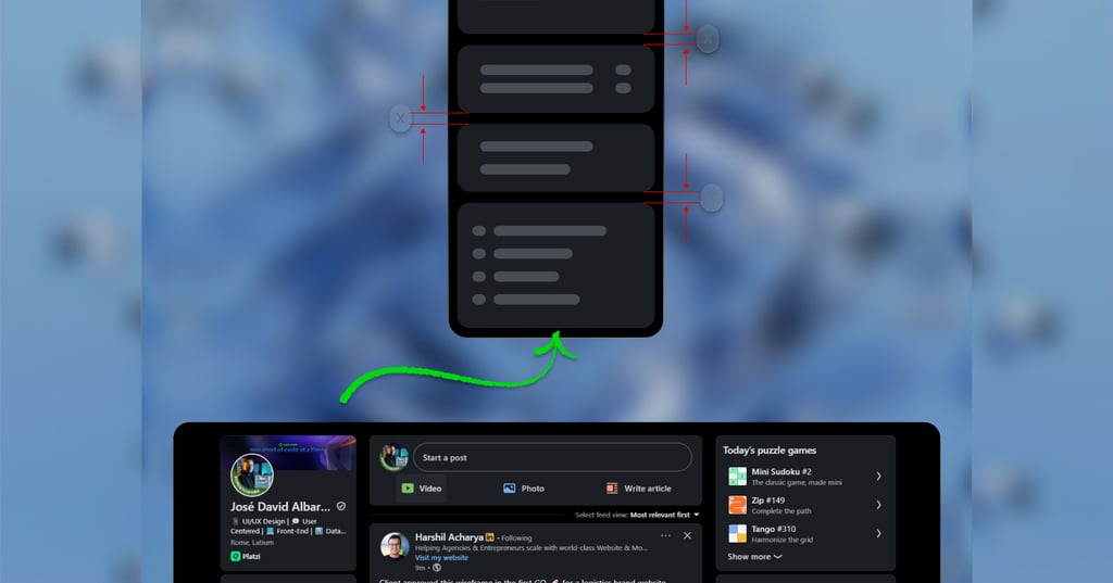
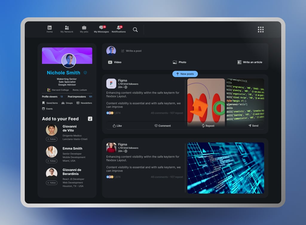
Profile Section (Left Column):
Contextual Grouping:
I’ve grouped user profile information such as professional data, profile impressions and views, and professional connection suggestions in the left section, in a compact visualization.
Space Optimization:
I’ve intentionally reduced the space between elements to prioritize content. The excessive “white background” has been transformed into a more structured canvas where information will uniquely stand out and have its own dedicated space.
Optimized use of UI Components:
Consistent and Rational Spacing:
I’ve created a stricter design grid to ensure consistent spacing between elements, thereby creating a sense of order and professionalism.
Enhanced Visual Hierarchy:
I’ve developed a small design system defining font sizes, weights, colors, and buttons for a clear visual hierarchy guiding the user’s eye to the most important information.
Optimized main navigation:
Compact Navigation:
I’ve optimized the space of icons in the main navigation bar by logically grouping related icons, freeing up even more space and eliminating the feeling of visual overload.
Organization of the Main Feed:
Unified Content Cards:
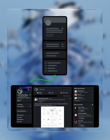
I’ve improved the design of each content card by restructuring the internal information: author details (profile picture, name, title), post content (text, images/videos), and interactions (reactions, comments, shares). This is all grouped into a more efficient layout so that the card, as an element, fits optimally and functionally within the grid.
Visual Categorization:
Interactive buttons on the cards such as “Like,” “Comment,” “Repost,” and “Send” have been hidden to give better visual prominence to the post card. When the user hovers over the card, the grouped buttons will appear, allowing users to scan the feed more efficiently and mentally filter content without any visual noise.

My conclusions and it's benefits
These solutions significantly enhance usability by drastically reducing cognitive load. By logically and visually grouping information, users no longer have to “hunt” for scattered data; it’s coherently presented, also reducing the feeling of information overload and duplication.
I am confident that these changes optimize the overall experience, as the feed is easier to scan, and information is assimilated much faster. Decisions like interacting with a post, connecting with a professional, or reading information are made with greater ease.
I believe this proposal would transform the LinkedIn feed into a more powerful, intuitive, and efficient tool, and you’ll no longer feel lost in a sea of white space.

José David Albarrán Velasquez
© 2025